Classification of Objects by Artists in the Harvard Art Museums Collection
by Carey Gibbons @careygibb
These stacked bar charts and pie charts show the percentage of drawings, prints, photographs, and paintings produced by specific artists in the Harvard Art Museums collection (based on the first 50 results). The top two charts show the classifications by artist, while the bottom two show the percentage of works by each artist within each classification. I made the charts using the website datawrapper.de after using integromat.com to pull data from the Harvard Art Museums API and generate spreadsheets in Google Sheets.
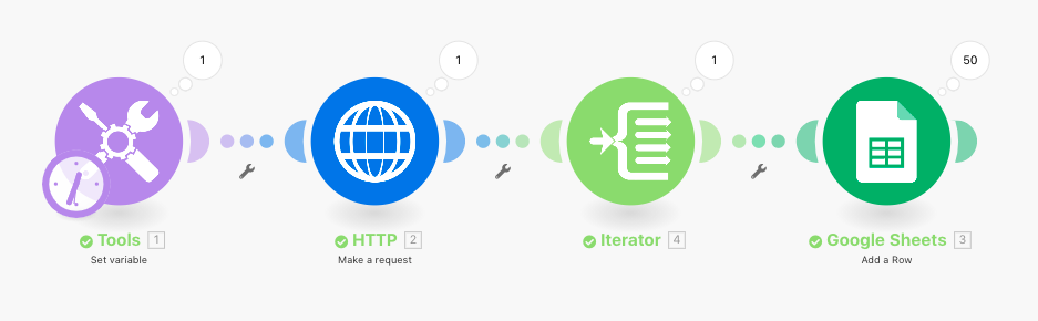
This screenshot above shows the scenario I created in Integromat, which includes Tools (“Set Variable”), HTTP (“Make a request”), Iterator, and Google Sheets (“Add a row”).
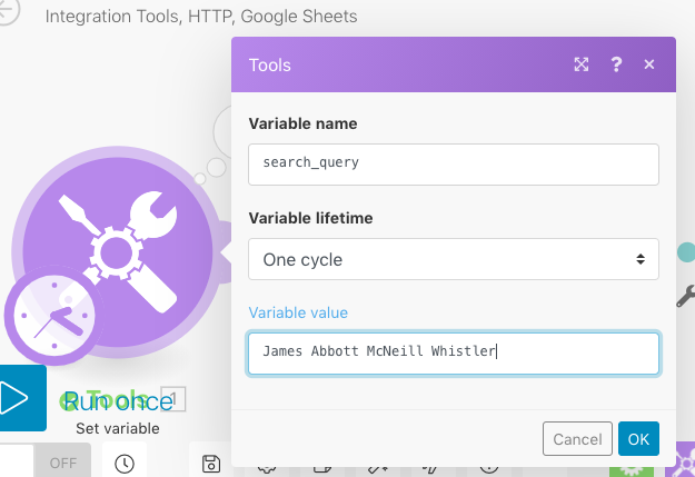
This screenshot above captures what appears when you click on “Tools.” As you can see, the Variable name is “search_query,” the Variable lifetime is “One cycle” (the default setting), and the Variable value is the name of the artist (in this case “James Abbott McNeill Whistler”). I changed the Variable value depending on which of the 6 artists I was searching.
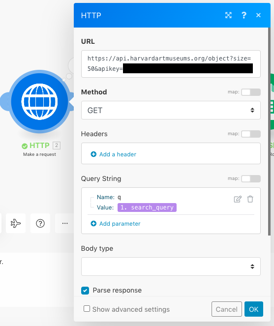
This screenshot above captures what appears when you click “HTTP.” I followed these instructions in order to figure out the URL, tailoring my results to the number “50” (the number of results that appears on a page) and also editing the link to include my Harvard API key (blacked out above for privacy), which I obtained by following the instructions here. I used the “GET” Method and entered “q” for the Name of the Query String and selected “1. search_query” for the Value. I also clicked “Parse response.”
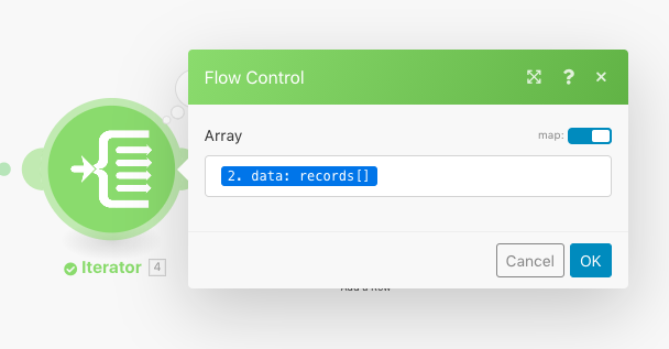
This screenshot above captures what appears when you click “Iterator.” The map setting was on by default, and I entered “2. data: records[]” in the Array field in order to target the information that was most useful for me.
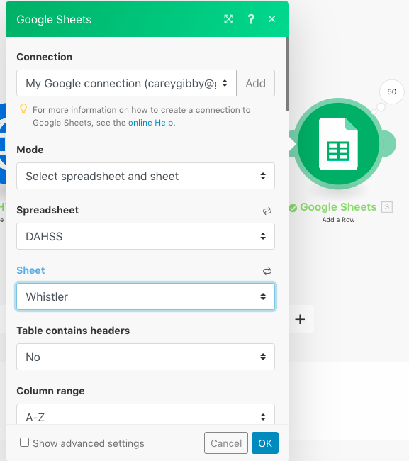
This screenshot above captures what appears when you click “Google Sheets.” I connected to my Google account and created a new spreadsheet titled “DAHSS,” which I selected in the Spreadsheet field. “Select spreadsheet and sheet” was the default in the Mode field. The spreadsheet contained different sheets dedicated to different artists. In this case, I selected the “Whistler” sheet in order to make the Whistler search results appear there.
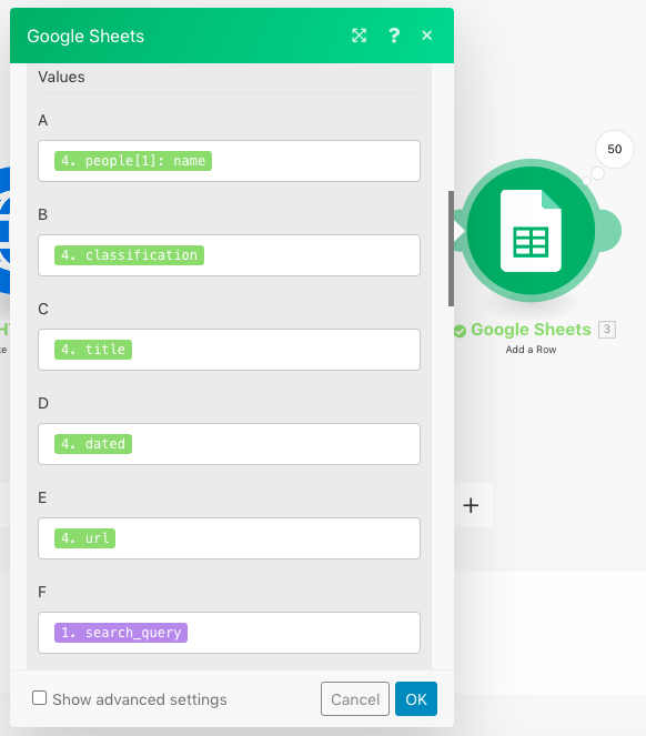
This screenshot above shows the data that I chose to pull from the Harvard Art Museums API and place in the columns of the sheets that I generated.
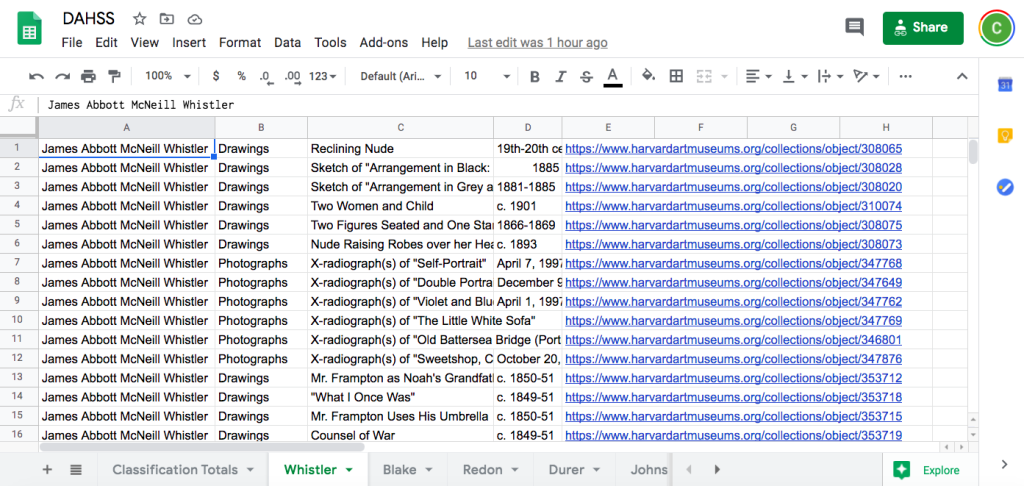
This screenshot above captures the sheet that was generated automatically for Whistler when I clicked “Run” on Integromat. This screenshot doesn’t capture the full sheet – there are 50 rows total, reflecting the 50 first results on the Harvard Art Museums website. Each object has a row, with columns showing artist, classification, title, date, URL, and search query. I ended up with sheets like this for each of the 6 artists I chose.
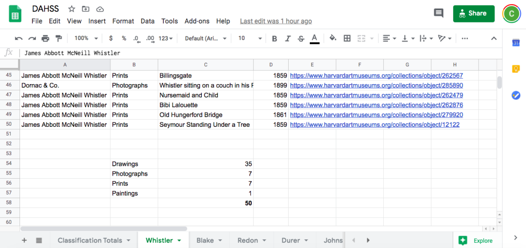
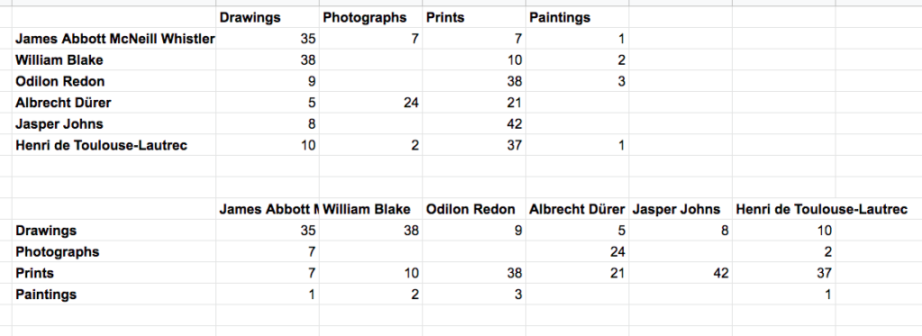
This screenshot above captures the tally of drawings, photographs, prints, and paintings that I did at the bottom of each sheet. I used the formula “=UNIQUE(B1:B50)” to list all the different classifications above, and then used the “COUNTIF” function to count the number of times each classification appeared.
I then made another final sheet that gathered all the results together in a format that would be easy for Datawrapper to utilize. The information was then fed to Datawrapper to generate the charts at the top of this page.
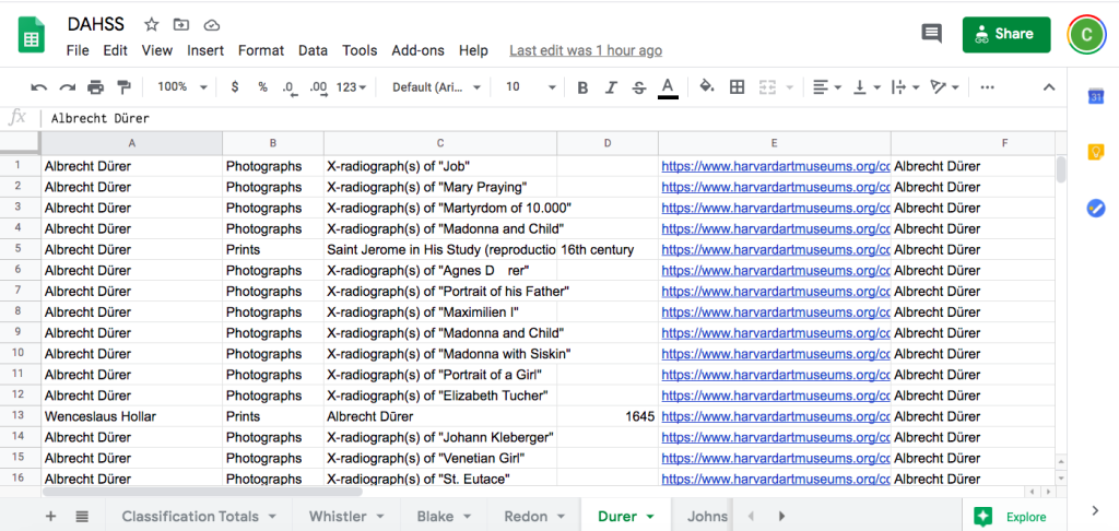
This screenshot above captures one problem I encountered when searching the Harvard Art Museums collection. The results for Albrecht Dürer (1471–1528) included photographs, which clearly Dürer did not create! These photographs appear to be conservation-related.
Overall I found the Harvard Art Museums website to be user-friendly, however. I started working with the Rijksmuseum website but found that the Harvard Art Museums provided more options/categories of data. (Harvard provides 94 options/criteria to pull v. the Rijksmuseum’s 28 options.) I was also more familiar with the Harvard Art Museums collection, which was helpful when selecting artists to search.
I found Integromat challenging to use initially, but as the DAHSS went on, I became more familiar with it and ended up generating some interesting information. I am looking forward to exploring it more in the future. I would like to experiment with larger datasets and search for more specific information (i.e. lithographs by women or the most viewed/searched for nineteenth-century paintings). Additionally, it could be useful in pointing out strengths or gaps in museum collections and/or showing collecting trends.
I’d love to hear from anyone who has used Integromat for art history research or with a broader interest in digital art history. Say hello on Twitter: @careygibb!